a little bit to make it a tad interesting if people think that the main area is to flat above all the news just go find the following:
Code:
<div class='myBlock-cap'><span style='font-weight:bold;font-size:12pt;'>{$lang['news_title']}</span>{$adminbutton}</div>
then replace with:
Code:
<div style='margin-top: 5px;box-shadow: 0 3px 10px rgba(0, 0, 0, 0.9), inset 0 1px 0 rgba(255, 255, 255, 0.2);'>
    <div class='myBlock-cap'><span style='font-weight:bold;font-size:12pt;'>{$lang['news_title']}</span>{$adminbutton}</div></div>
it should make it appear like this:
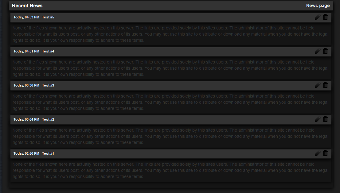
then it should kinda look more appealing well it does in my eyes.
 Small Fix:
Find:
Code:
$HTMLOUT .= "<div class='myBlock-con'>".format_comment($array['body'])."</div><div></div></div><br />\n";
Replace With:
Code:
$HTMLOUT .= "<div class='myBlock-con'>".format_comment($array['body'])."</div><div></div></div><div style='padding: 1.5em;'></div><div style='margin-top: -35px;'></div>";
OutCome -
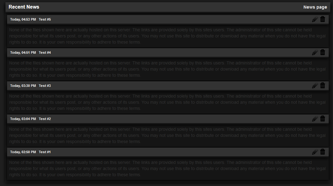
You will notice it makes the bottom more neater and brings it up closer then using <br /> tags as you will have noticed it gave it a massive gap at bottom well that shouldn't be a issue anymore ;)